
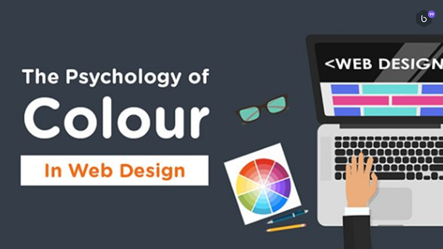
Creating a new company website? Need help choosing a colour scheme that helps you attract and convert the right audience?
If your target market is made up mainly of women, then pink is a good colour for you. The colour is known to raise emotions of fun and romance. Pink is associated very strongly with youthful femininity. It is ideal for websites that target a particularly feminine audience.
Blue signifies trustworthiness and provides an air of coolness. Any website that caters to online prescriptions, monetary transactions, or any other niche that demands reliability would be best served by this colour.
Nothing holds people's attention like red. It's considered the most effective colour for call-to-actions. Red is a stimulating, exciting colour. It is associated with passion, power and sometimes anger. It can be used for warnings or to show danger, but it can also suggest strength, determination and boldness.
Green is the colour of peace, tranquillity, and nature. It can give users feelings of calm, rejuvenation, affluence and optimism. Darker shades are more linked to money, so sites that want to suggest affluence, growth and stability often use those shades. Lighter shades are more associated with spring and growth, so websites that want to reflect relaxation, freshness and honesty use lighter shades.
Yellow is said to describe a healthy mind without worries or depressing thoughts. It's best suited for online stores that sell products like kids' toys. Yellow is considered the most energizing colour. From the earliest ages, people learn to associate 'low with the sun, so it becomes associated with warmth and happiness. That makes bright yellow perfect for children's it grabs their attention.
Purple oozes elegance and sophistication.
This colour is ideal for a website that features niche, luxury products.
Orange can signify sophistication, but at the same time be attention grabbing. Orange is a more balanced and less overwhelming colour than red. Vibrant, energetic, friendly and inviting, it is ideal for designs that need movement and energy. Websites that want to show case their creativity often choose orange because it is unique and exciting, but it still has the comfort of a warm colour.
As a metallic colour, gold signifies power and prestige.
It works well with other colours that signify elegance, such as green and purple.
Black is versatile and goes well with any other colour. It's best used to bring about a contrast with the rest of the colours used in the website.
Brown is a nondescript colour that enthuses relaxation and calm. This colour is perfect for health and wellness websites. Creams are calm, elegant and pure, making them a great background colour for a website that wants to imply a sense of tradition. Tans are conservative and bring to mind piety. They can be dull, but they can also be reassuring, ideal for a site that doesn't want to be too bold or outrageous.
Hit us if you have any queries! Contact us at BEYOND99 as we are always there to help – reach our team of experts for their advice. Or to strike a quick chat, you can write us on Facebook Messenger here – We’re quite active and love to hear from our you.

Written by Khushboo Nangalia